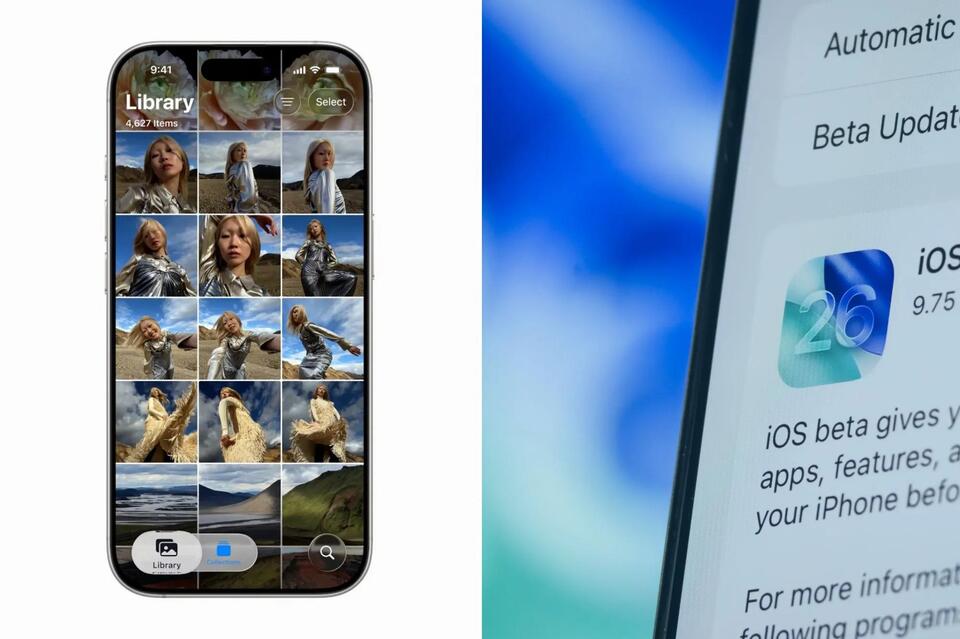
Is Apple’s Liquid Glass a Design Fail?
Apple’s new Liquid Glass interface is stirring up serious debate. Some call it a stunning leap forward, while others say it’s a usability nightmare—blurry icons, hard-to-read menus, and distracting transparency. Is this bold move a sign Apple’s lost its design edge, or is it just ahead of its time? Would you trade clarity for a futuristic look? Let’s hear your take on form versus function in UI design. #AppleDebate #LiquidGlass #UIDesign #Tech
2025-06-11
write a comment...
